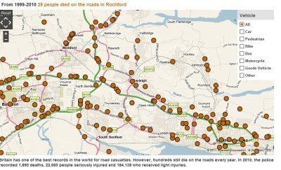
The BBC website has a map showing all the road deaths in this country from 1999 to 2010.
It’s a very sobering experience to look at it and reflect that every orange circle represents a collision in which somebody has died.
The map is here, and we’ve shown below what it looks like for our area:
Let’s all be careful out there.

